Overview
Bankrate has traditionally been an SEO-driven business. Consumers come to us from Google search looking for financial guidance through three facets which include industry leading editorial content, tools, and financial product comparison tables. Because of our strong SEO presence and partnerships, Bankrate is an extremely lucrative business for having a purely unknown user base. Customers come from search, find a financial product they like, and transact on our rate tables. The customer journey ends there. Although already lucrative, we realized an authenticated customer could be worth so much more if we gave them a reason to create an account with us and build a long lasting relationship for their every financial need. But this experience had to be built from scratch...
Role
Information Architecture
Interaction Design
Visual UI Design
Interaction Design
Visual UI Design
Defining the problem
I partnered with our UX Researcher and we started having conversations with multiple stakeholders across the business to understand existing problems for each business vertical and we also dug into existing research that had been done by the verticals. A common theme started to emerge which was lack of knowledge of all of Bankrate's resources for financial guidance. Because Bankrate was an SEO based business, consumers would land on 3 page types depending on what they searched for on Google. Those were:
1. Article pages
2. Calculator/Tool pages
3. Rate table comparison pages
Depending on where you would land would dictate your lack of knowledge of the other page experiences. For example, if you landed on an Article page to read about the best Mortgage rates you had no idea we also had a Mortgage rate table where you can compare the best Mortgages in the country and transact on one of them.
Or if you landed on a rate table and weren't read to transact, you had no idea we also had the top rated Mortgage calculator where you could take a step back and do some calculations to better inform your purchasing decision. Users would land on our pages, get the information they were looking for and drop off. They weren't spending the time exploring our site and discovering these crucial resources for financial guidance. We also had no Brand presence which was contributing to this lack of discovery.
The process
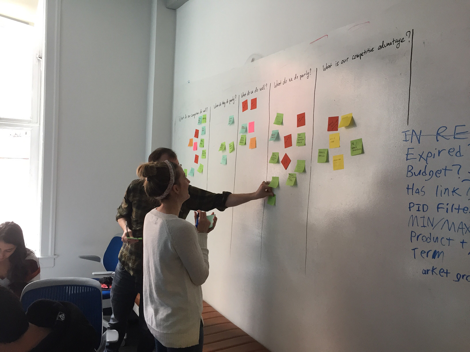
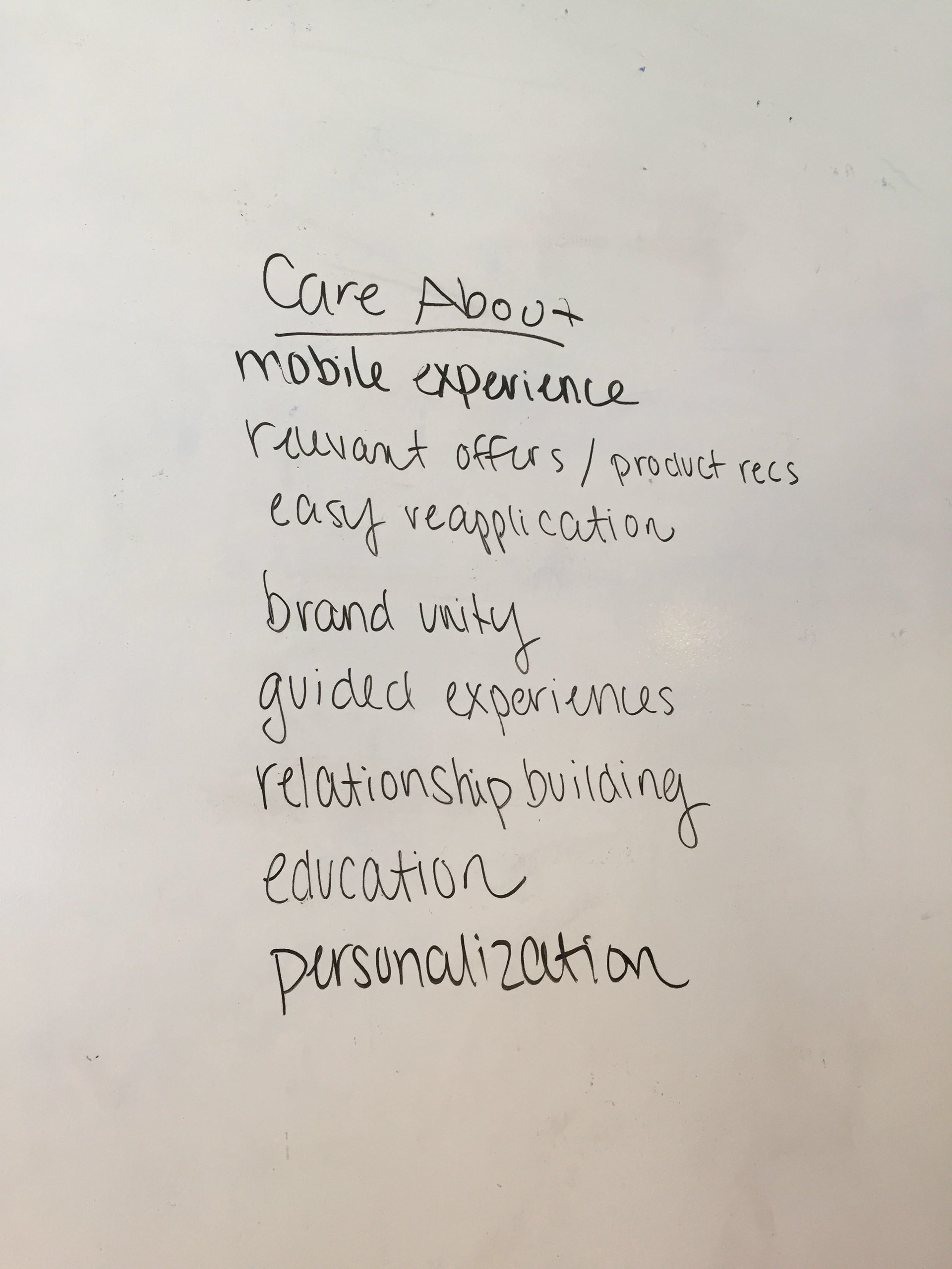
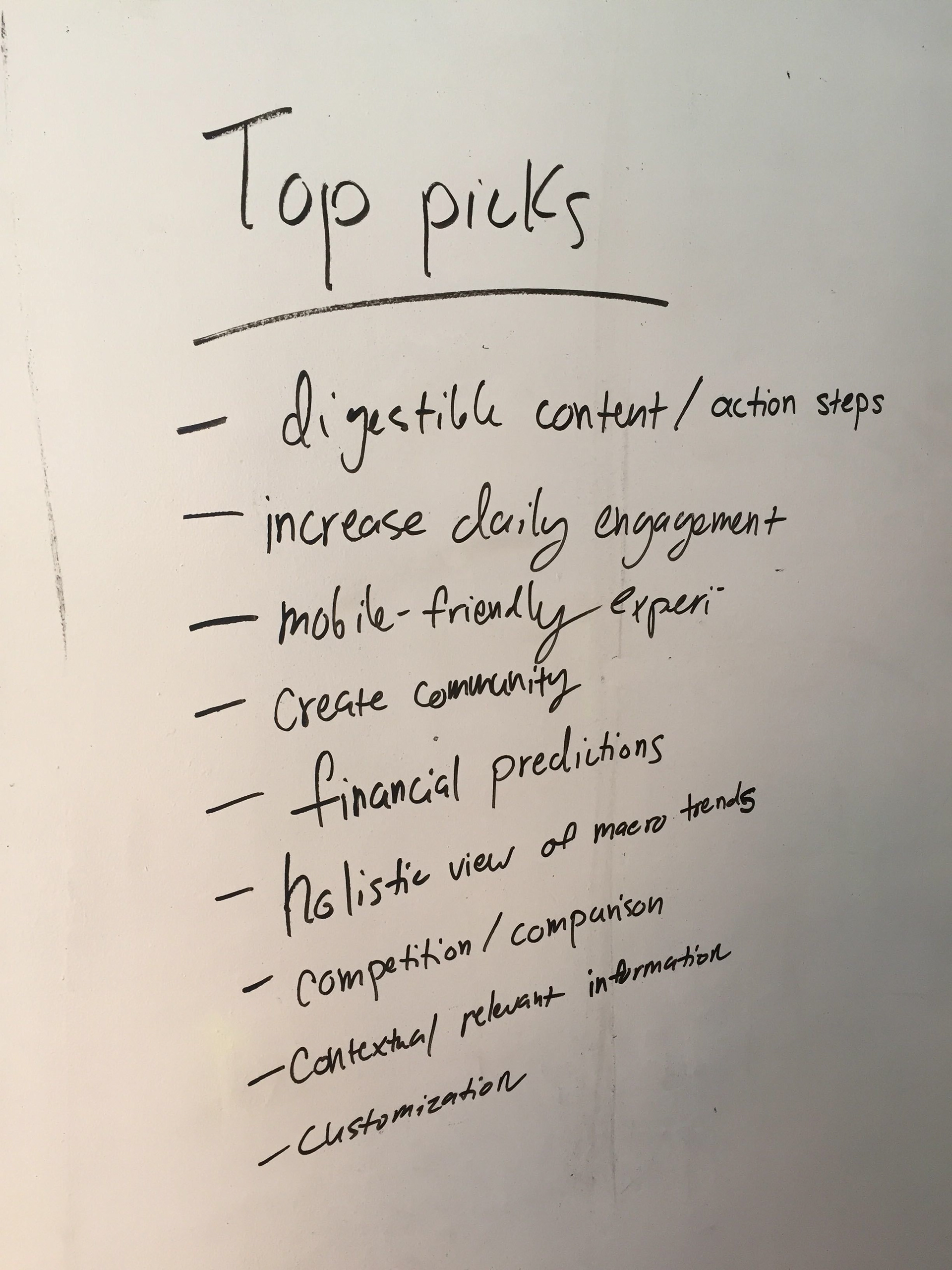
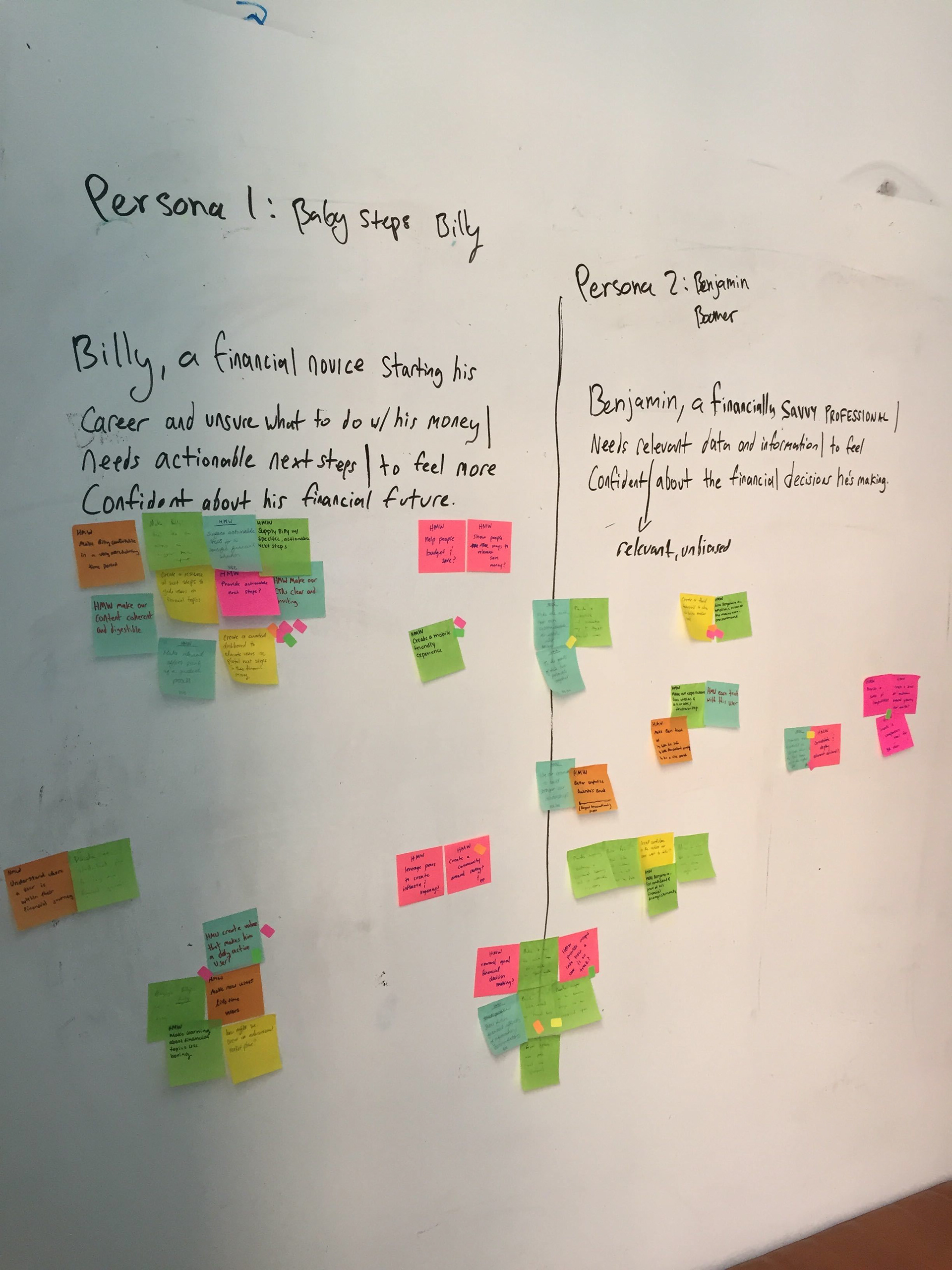
We kicked off ideation with a co-creation sprint after our UX Research team put together specific personas on who our target users would be for an authenticated experience.
Problem statement for Billy
Billy, a financial novice starting his career and unsure what to do with his money needs actionable next steps to feel more confident about his financial future.
Problem statement for Benjamin
Benjamin, a financially savvy professional needs relevant unbiased data and information to feel confident about the financial decisions he’s making.
Alignment & Sketching
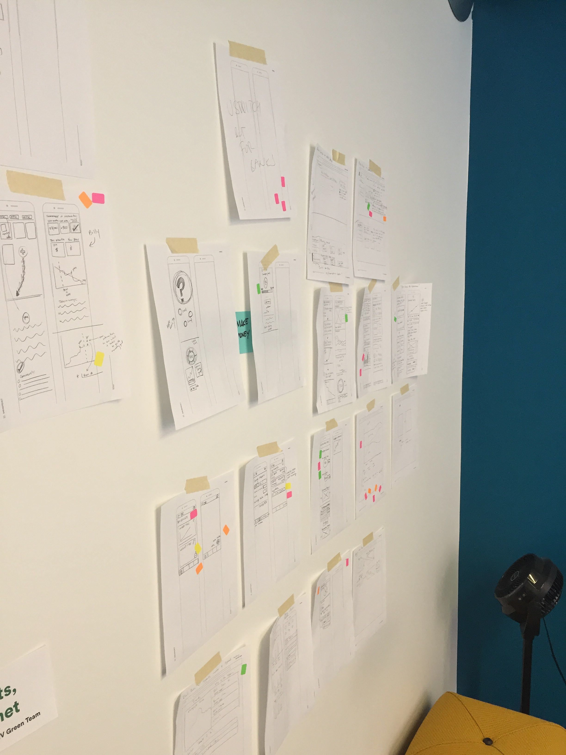
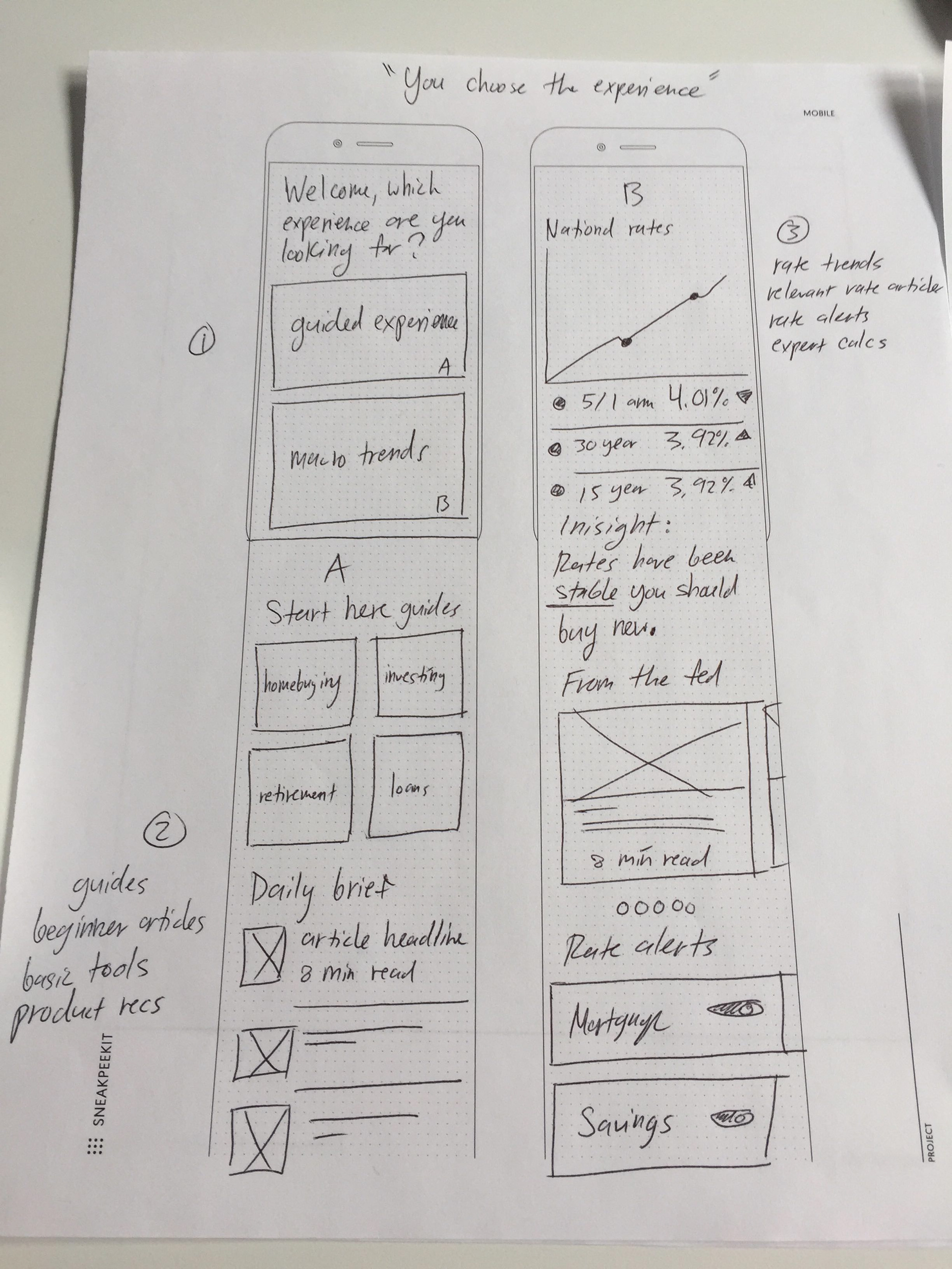
The hypothesis
The hypothesis was to create an authenticated experience that would pull in all of our resources into one place that would be easily discoverable for users and allow them to have custom dashboards based on their financial interests. This dashboard space would enable each business vertical to contribute widgets and drive awareness for their specific business needs. It would be a single space where users could:
-Read up on the latest industry news
-See their pre-approved offers
-Track rate trends
-Calculate and refine their numbers with our tools
Wireframes
After the co-creation I wire-framed the sketches with the most energy and I sent them to user testing to validate our assumptions and iterate the designs based on testing.
Visual UI Design
After wire-framing and testing I designed the UI and prototyped the experience and ran it through user testing one more time before launching.
Contributing back to the design system
I created standards and principles for the authenticated hub to help guide business vertical teams in creating new experiences for their specific users using the authenticated platform.
Designing an account creation system
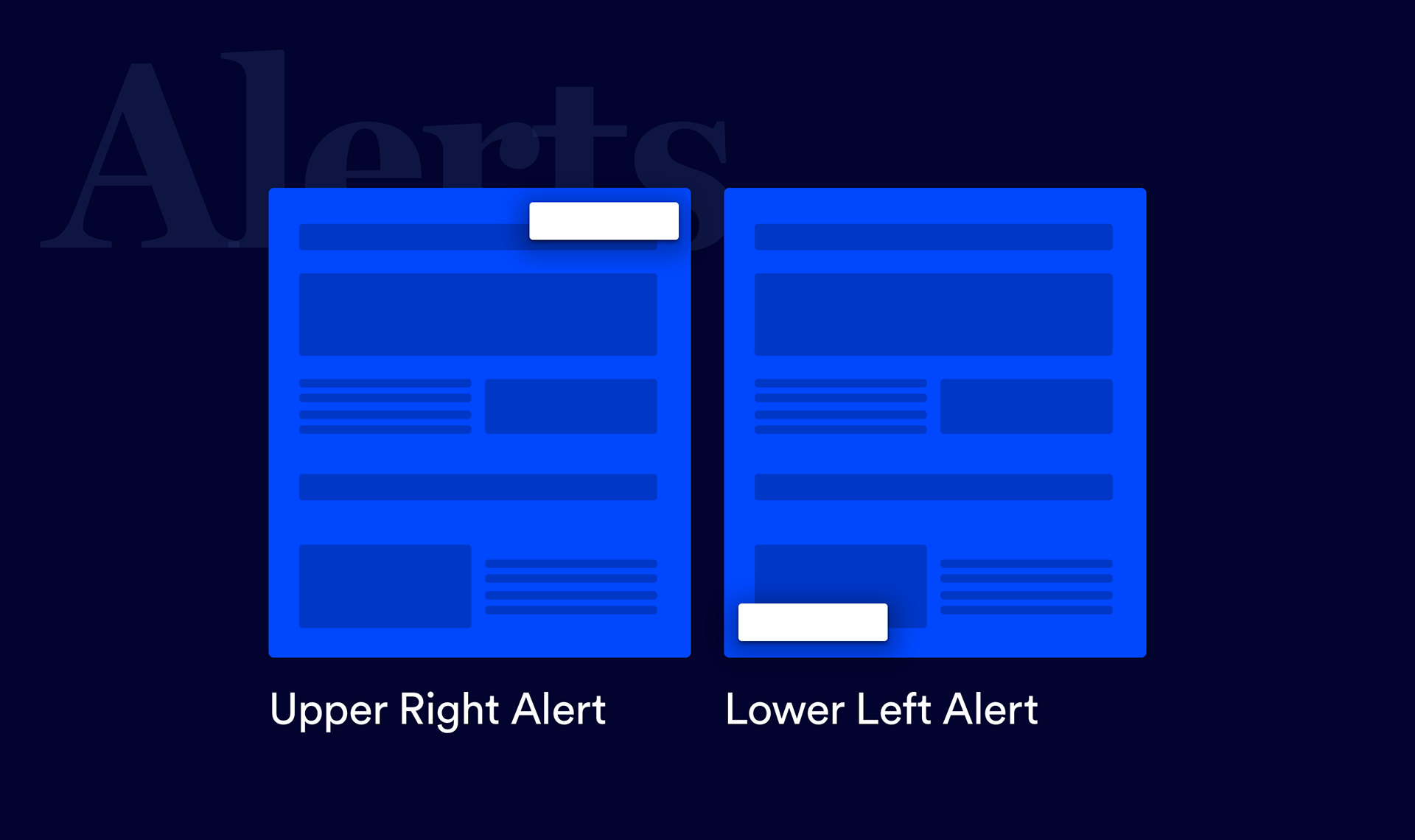
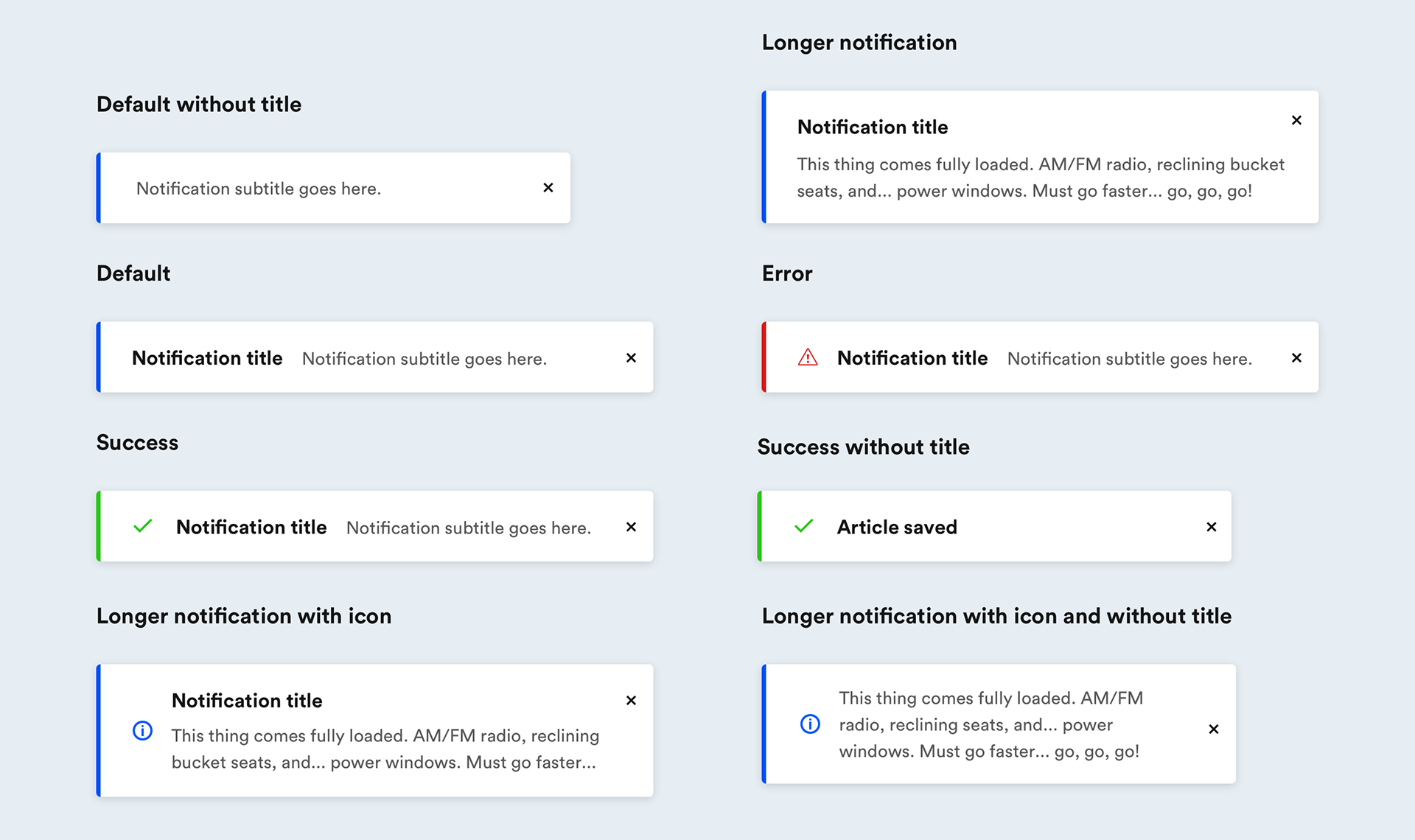
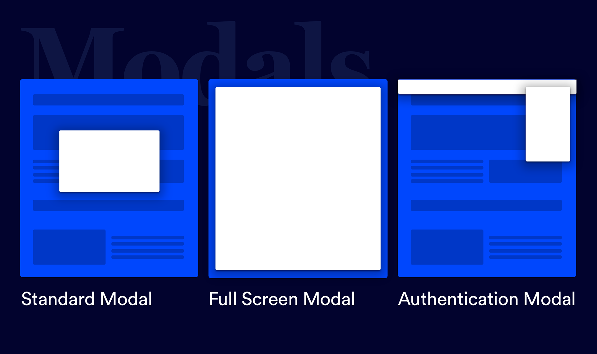
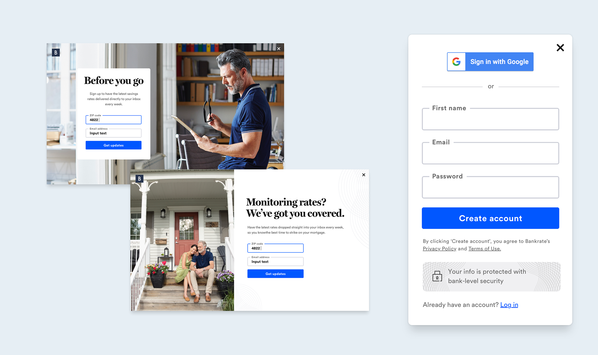
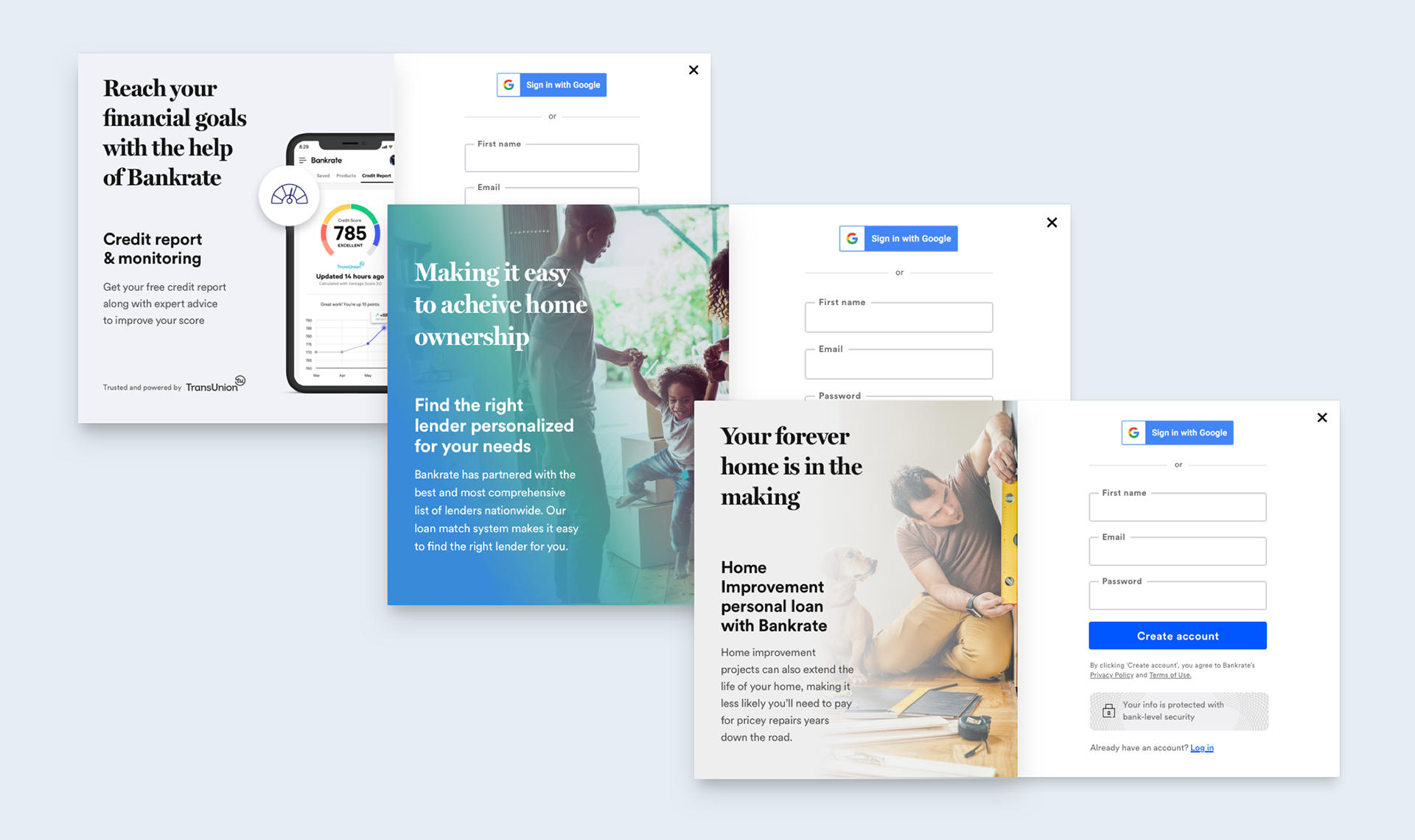
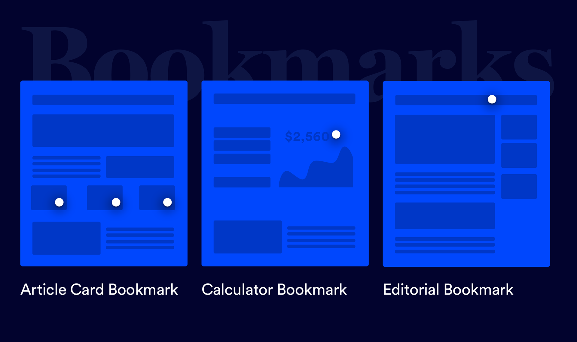
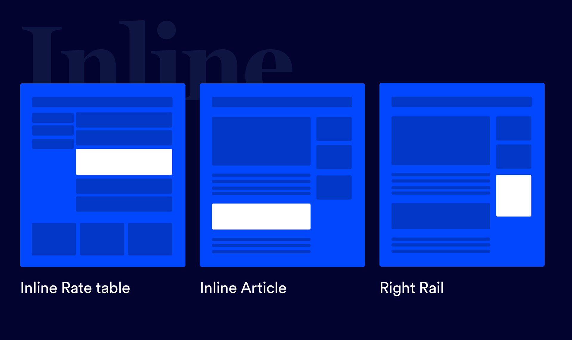
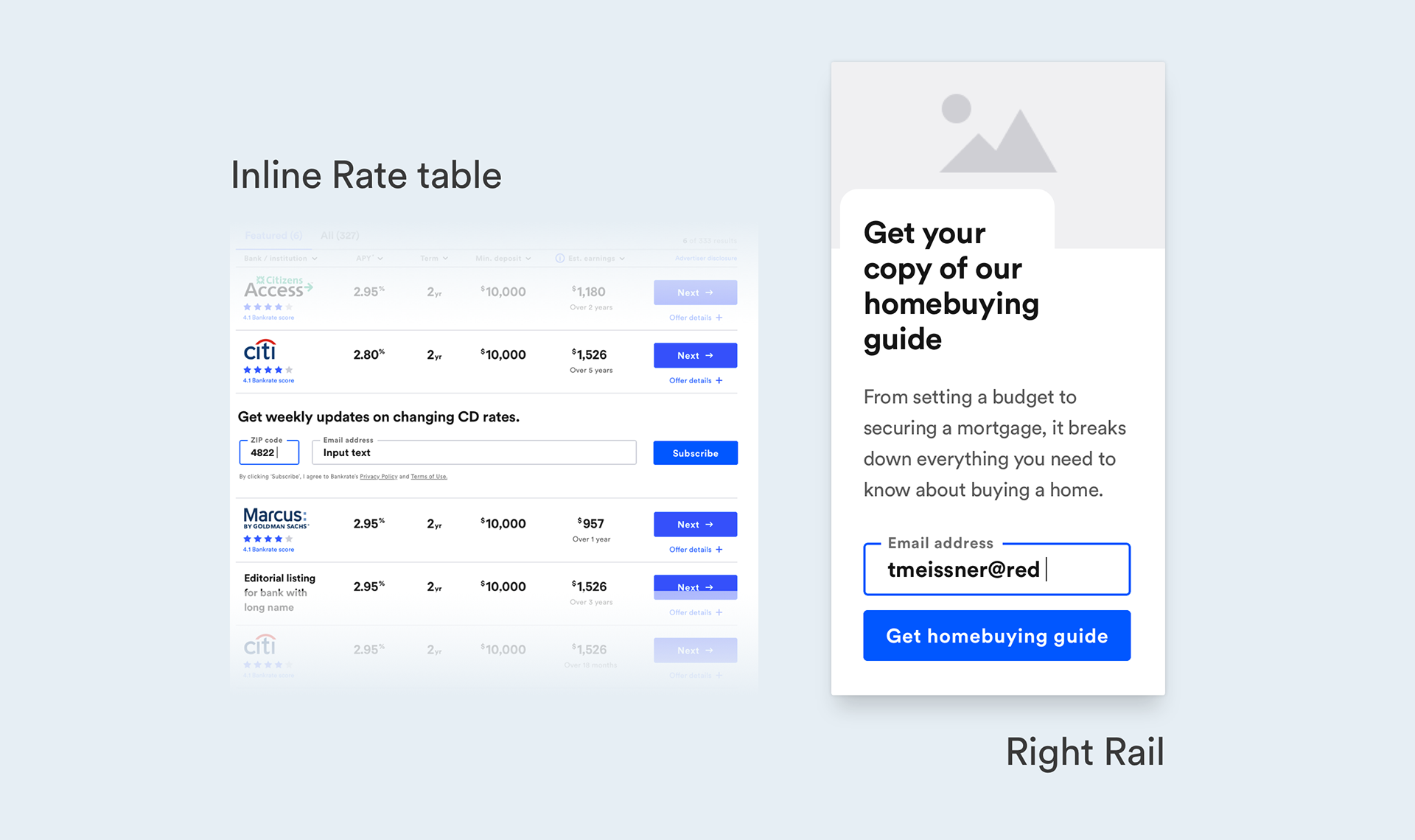
I took a systems approach to crafting an account creation system throughout the site with different layers of authenticating users. From page agnostic options to contextual inline page placements. This system allowed us to test different options for content to understand which value props were resonating most within specific business verticals with the end goal being able to have a consistent message across the entire system to support different growth campaigns.

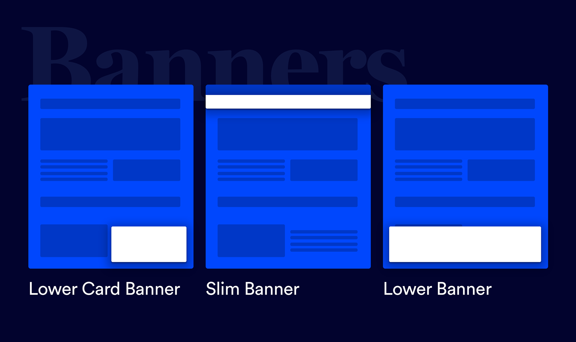
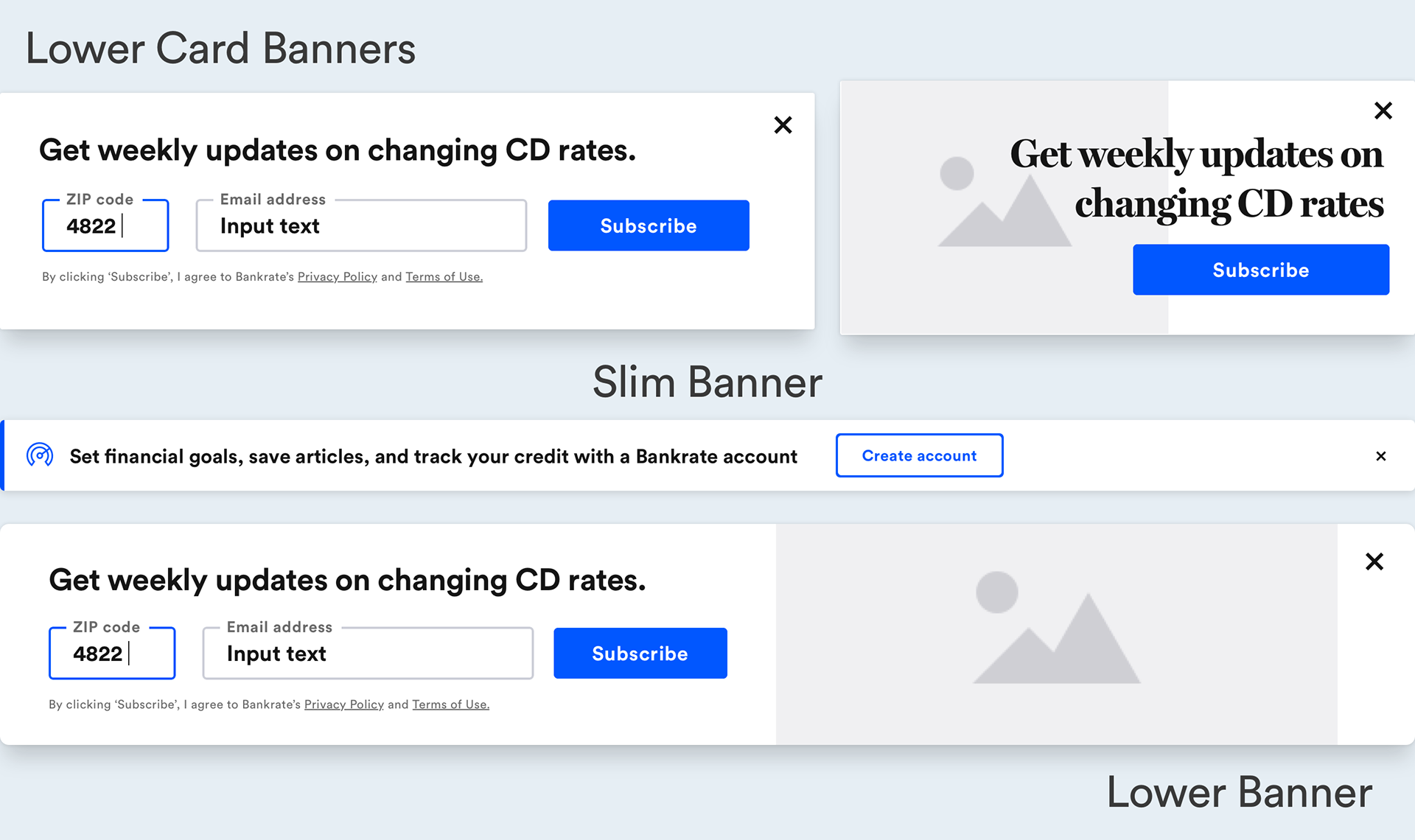



Designing an email design system
Part of the account creation system was hooking into our email team to drive re-marketing and re-engagement. Emails up to this point were expensive to code and launch and required a lot of effort on our end. I decided to create a design system for emails where we no longer had to rely on a third party to code each email and speed up the delivery process. With the email design system in place, we could internally launch emails and test different sets of content faster while saving significant money.
Initial impact
Account creations started rolling in at a steady pace and in the first time of the teams existence, we started becoming profitable through re-marketing and re-engagement adding a new revenue stream for the business and verticals we were now supporting.
Next phase
With account creations rolling in we knew we had to keep iterating on the experience and thinking about what would come next. Because our brand vision was "Guiding you through life’s financial journey" we knew the next step had to get closer to providing guidance based on our users unique financial situations. So we started designing a personal finance feature set as the next phase for our Auth experience.
Integrating with MX
In order to deliver on this feature set, we partnered with MX to power the money experience. MX allowed our users to connect their financial accounts, parse their data, and gave us the tools we needed to provide our users with actionable insights.
Learning
Bankrate has been helping people make smart financial decisions since 1976. To round out the experience we started testing into education with weekly quizzes. We knew checking and optimizing your finances wouldn't be enough to sustain weekly engagement. The results were promising with weekly quizzes being the most engaged content widget on the Authenticated experience. With this data in hand, we decided to invest heavily into learning and produce our own high quality educational video courses. We hired another product designer to expand this section of the authenticated experience. This also was a true differentiator amongst our competitors.
Bringing it all together
Now that we had a robust experience built out, we launched a landing page that covered all the value users get when they create an account with us and have a central place where we drive all users from our authentication triggers throughout the site.
The impact
Since launching the Authenticated experience, we have been building a long term relationship with a growing group of authenticated users that have used our platform to learn, manage, and act on optimizing their personal finances leaving our users educated, empowered, and trusting in the Bankrate brand.
2.9 million
Authenticated users
$1.2 million
Monthly assisted revenue
20%
Monthly active users

